A Monster Glow-Up
April 24, 2026Every brand character has a shelf life. The friendly insurance gecko, the jolly fast-food clown, the cereal box tiger — these icons were designed for a specific moment in culture, and culture has a habit of moving on. If your mascot was born in the era of Saturday morning cartoons and supermarket circulars, it may be speaking a visual language that today’s audience simply doesn’t hear anymore.
Refreshing a corporate mascot isn’t about erasing history. It’s about translation.
Why Mascots Go Stale
Character design carries the fingerprints of its era. The bold outlines and hyper-saturated colors of the 1980s, the blobby 3D renders of the early 2000s, the overly literal illustrations that tried to explain the product rather than embody the brand — each era had its conventions, and those conventions age visibly. What once read as friendly can start to read as dated; what once felt energetic can start to feel chaotic.
There’s also a subtler problem: audience expectations around representation, tone, and relatability have shifted considerably. A character designed before the social media era was built for passive viewing. Modern mascots need to hold up as profile pictures, animated stickers, and the star of a 15-second video scroll. That’s a fundamentally different job.
What a Refresh Actually Involves
The best mascot refreshes feel inevitable in hindsight — like the character always looked this way, just younger somehow. That effect doesn’t happen by accident.
Simplification is usually the first move. Contemporary illustration trends favor cleaner lines, reduced detail, and more expressive silhouettes. When a character can be recognized at thumbnail size or as a tiny emoji, it becomes far more versatile. Complex textures and drop shadows often need to go.
Proportion and expressiveness get revisited. Modern character design tends toward larger eyes, looser postures, and a wider emotional range. Characters that were once stiff and authoritative are being softened into approachable collaborators. This mirrors a broader shift in how brands want to be perceived — less institutional, more human.
Color palettes are recalibrated. Flat and semi-flat color systems have replaced the gradient-heavy rendering of the 2000s and 2010s. More importantly, palettes now need to work across light and dark interfaces, on screens with varied color profiles, and alongside a brand’s full digital ecosystem.
The character’s personality gets sharpened. A refresh is a good opportunity to ask: what is this mascot actually for? Is it reassurance? Playfulness? Expertise? A well-defined character role makes every design decision easier and makes the mascot more consistent across all the places it appears.
Keeping the Equity You’ve Built
The risk of a refresh is alienating the audience that already loves the character. Brand equity lives in specific visual cues — a color, a silhouette, a signature gesture — and those anchors need to survive the redesign even if everything around them changes.
The most successful refreshes identify two or three elements that are truly load-bearing and protect them deliberately. The Michelin Man has been redrawn countless times; the stack of white rings is untouchable. The Geico Gecko’s color and dry wit persist across every animation style update. These through-lines are what make a refresh feel like an evolution rather than a replacement.
Bringing a New Audience In Without Losing the Old One
A phased rollout — gradual introduction across digital channels before a full transition — gives existing fans time to adjust and creates natural moments for engagement. Behind-the-scenes content showing the design process, or direct acknowledgment of the character’s history, can turn a brand update into a story that audiences want to follow.
The goal is a character that long-time customers recognize and new ones immediately embrace. When it works, a refreshed mascot doesn’t just look better — it does more work for the brand than it ever has before.
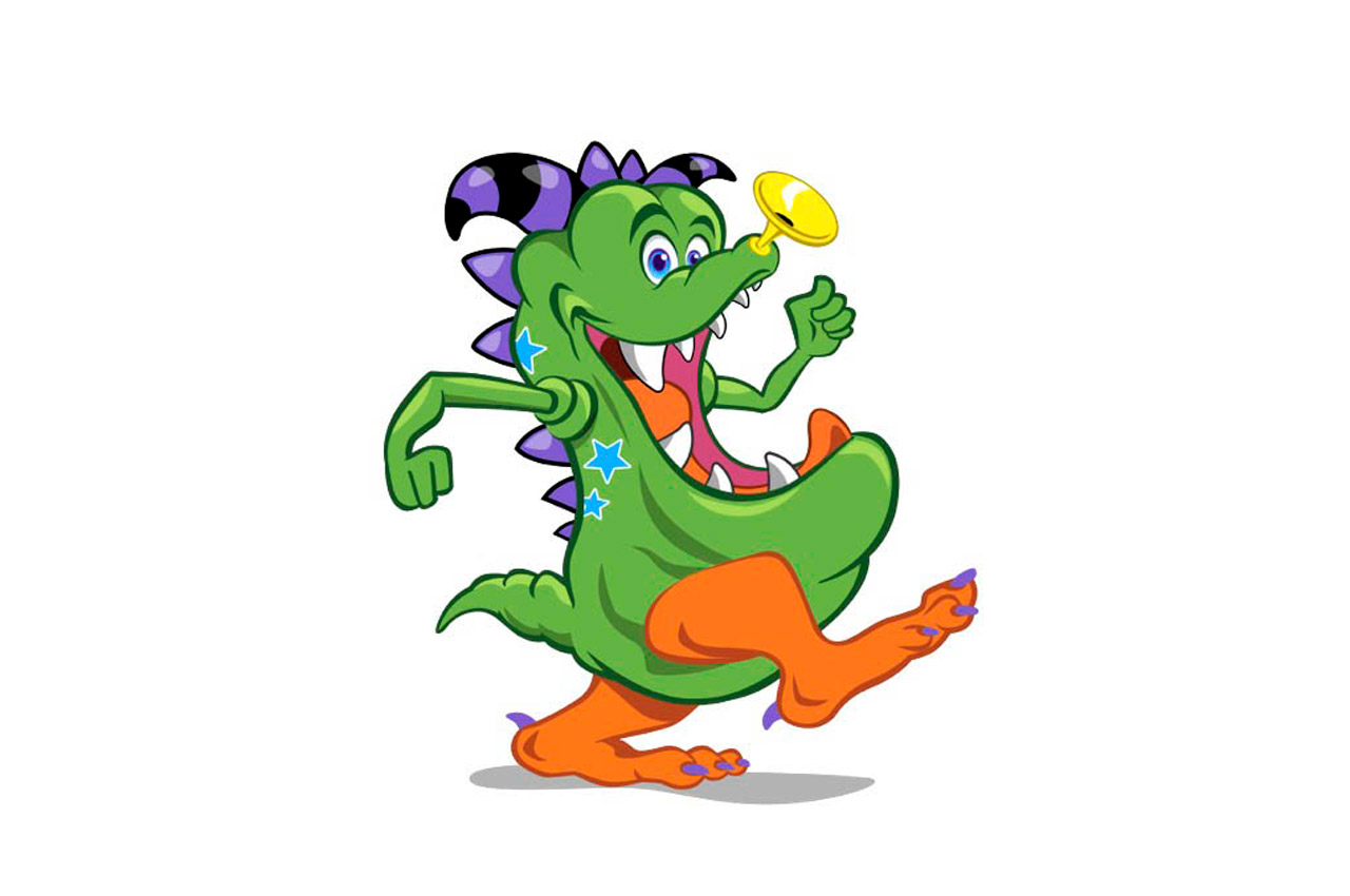
As the once Creative Director at Monster Worldwide, our team re-engaged with the original artist, Allan Downing, who had created the iconic ‘Trumpasaurus’ mascot for Monster.com, to give our favorite and leading monster the glow-up he deserved. This was a lot of fun and a super creative project I still love to share. You da Monster.