Everything an auto loan borrower needs, before they ever scroll.
April 22, 2026DCU came to us with a familiar credit-union challenge: a product page that asked too much of the visitor. Rates lived in one place, calculators in another, comparison content further down, and the application button was a long scroll away from the point where most members had already made up their mind. The page was thorough but diffuse — a menu, not a tool. Our charge was to compress the auto-loan decision into a single, confident view.
The operating principle
We organized the entire redesign around one rule: a member should never need to scroll to find the information that drives a decision. That meant treating the viewport as a dashboard rather than a narrative. Hero copy was trimmed to a single line of value. Rates, payment math, qualification cues, and the apply button were pulled into a tight, instrument-like zone. Everything that had previously sheltered below the fold — supporting articles, sibling products, disclosures — was reframed as a second layer available on demand, not as a requirement of the journey.
The viewport became the product. Scrolling became optional, not obligatory.
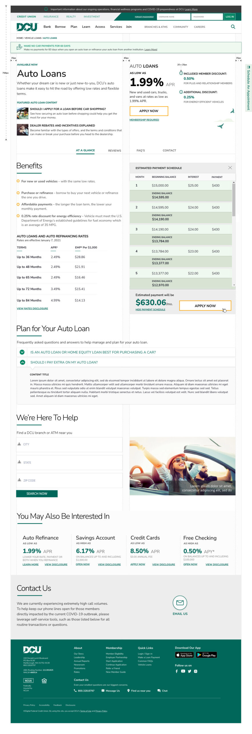
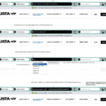
A legible rate card, not a rate table
Rate disclosure pages have a bad habit of reading like compliance documents. We rebuilt DCU’s rate card as an interactive information toolset: members choose vehicle type (new, used, refinance) and term length, and the card resolves instantly to the APR band that applies to them, with credit-tier context written in plain language. Fine print is still present — this is a financial product — but it expands on request rather than dominating the frame. The effect is a card that feels advisory instead of defensive.
Calculators that behave like tools, not forms
The interactive payment tools were the most scrutinized part of the design. We replaced the familiar calculator pattern — a stack of labeled inputs and a submit button — with a live model. As the member adjusts loan amount, term, down payment, or trade-in value, the monthly payment, total interest, and payoff date recompute in real time. A secondary toggle lets members compa
re two scenarios side by side, which is where refinance customers usually convert. Because the calculator shares the same APR logic as the rate card, the numbers a member sees while exploring are the numbers they see on the application.
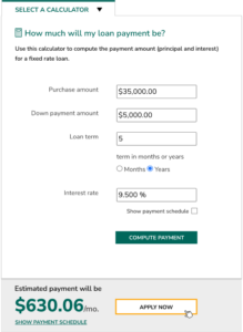
Design decision: we treated the calculator as the page’s primary body visual. Research showed that members who touched the calculator were disproportionately likely to apply, so we gave it visual priority over marketing imagery and kept it persistently visible as the member moved through related content.
Related articles, handled with restraint
Credit unions are, at their best, educators. But education modules are often where product pages begin to sprawl. We designed a compact related-content rail that lives inside the same viewport as the calculator: three curated pieces — “New vs. used: what actually changes your rate,” “Should you refinance right now?” and “Understanding GAP coverage” — each surfaced as a short, titled card. The rail rotates based on the member’s calculator inputs, so a visitor modeling a refinance sees refinance guidance, not generic buying tips.
Featured products, in their proper place
Cross-sell is where product pages most often betray the user. We resisted the temptation to pad the page with every adjacent offering and instead highlighted two that matter at the moment of an auto purchase: GAP coverage and the DCU auto-buying service. Each sits as a quiet tile, legible but non-competing, positioned so that a member can acknowledge them without being diverted from the primary task. Deeper product exploration is a click away; it is never in the way.
Why this layout works
The redesign is not a trick of density. It works because we made hard editorial choices about what deserves the viewport and what does not. Rates, payment math, related guidance, and complementary products share the frame because each of them answers a question the member is actively asking. Everything else — institutional history, marketing copy, redundant disclosures — was moved, condensed, or cut. The result is a page that treats the member’s time as the scarcest resource, which, for a credit union, is exactly the right posture.
Outcome
In early testing, members completed a rate-and-payment exploration in roughly a third of the clicks the legacy page required, and the apply button reached — once buried beneath three screens of content — became the most-touched element in the viewport. More importantly, the page reads the way a good teller sounds: direct, informed, and unhurried, with every answer already on the counter.