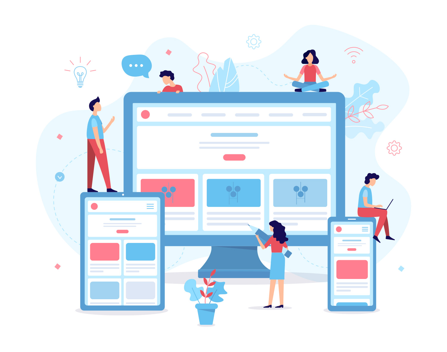
Adaptive Design vs. Responsive Design
November 11, 2024Two approaches for designing across the diverse range of devices are adaptive and responsive design. In the simplest terms, responsive design utilizes one layout and adjusts the content, navigation, and elements of the page to fit the user’s screen. The responsive design will reconfigure all design elements whether it’s viewed on a desktop, laptop, tablet, or mobile phone. With adaptive design, different fixed layouts are created that adapt to the users screen size. As opposed to the more fluid responsive approach, adaptive design employs multiple sizes of a fixed design.

The majority of new websites now use responsive design. When designing a layout that will be responsive you must take into account all the screens and devices a user may view it on. Certain elements may work and align great on a large desktop view but if you haven’t taken into consideration smaller screen sizes the layout will resize poorly.
With adaptive design the website will detect the user’s device type and adapt the template being used to fit that screen. The benefit is that the designer is able to have greater control of the elements and experience, with the tradeoff of a more time-consuming process to tailor for each device type.
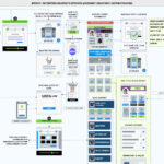
“Breakpoints” is a term typically used to refer to the different screen sizes used in adaptive design. For example, a landing page of a website will be designed as viewed on a mobile device, a tablet, and desktop. These are the 3 breakpoints and represent how the design will adapt. Therefore you don’t have to design for precise devices, but you can target a template for a particular device group.
When deciding on an approach, the key is to consider your audience first and foremost no matter what design technique you choose. Once you know exactly who they are and what devices they tend to access the site on, then it’s easier to design your content and layout with those users in mind. You may also have constraints imposed by a developer or client. For example, if timing or budgets are tight, responsive may be a better choice.
Designing for different devices
Digital product design is continuously changing. New advancements emerge all the time that influence a user’s experience and transform industries. It’s not enough to just factor in different screen sizes. We must take into account the device and how it’s interacted with. From different operating systems and their native functionality to the environment the user interacts with the device. All of these can impact how a design is experienced by the user.
Different devices provide services differently depending on the context. Designing to maintain the same user experience across devices can be a challenging task. The context a device is used in can impact design decisions. For example, a tablet is primarily used for content consumption while a desktop computer is typically used as a tool for more involved workflows like video editing, or data entry. To create the best experience for the user it’s important to develop effective strategies.
Luckily we’ve developed different approaches for designing in this increasingly complex digital landscape. Designers should start by understanding the audience and the context of the device, and then wield these different methods to achieve the best experience.
Considerations for cross-platform design
It’s important to consider making use of various device functionalities when designing digital products. Mobile devices have the ability to take advantage of functionality like GPS, biometric ID, bank card scanning, and QR code reading that can greatly improve the UX.
Gestures
Mobile devices and tablets allow users to interact with content in a unique way. The ability to pinch, zoom, slide images across the screen, and force-touch elements empowers the user to engage with the content in a new way. A long repeating row of the content may look great on a desktop computer, but for a mobile device, it may make more sense to allow the user to slide through the carousel one by one. It’s also important to think about the size of a person’s finger and how that translates to mobile interactions. UI elements should be a comfortable tappable size. If a user is struggling to select or tap an element it is likely to lead to a frustrating experience.
Hierarchy
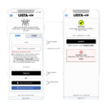
When designing for different devices the designer should always take a look at the layout hierarchy. Mobile experiences have limited space. The designer wants to ensure that key messages maintain the same prominence across devices. It’s important to ask what the most important action of the page is. If the call to action of a page is a sign-up button, make sure that this maintains it’s prominence across all devices.
Navigation
When designing navigation across devices, it is important to follow conventions for the device in question. Consistency is important to ensure that users don’t feel challenged trying to learn a new navigation paradigm.
Navigation design is complex. Thankfully there are many reusable design patterns to leverage when designing a user experience. No one pattern is necessarily better than the other. Each pattern that you use in your product will have to be carefully considered and tested before implementation. This ensures that the navigation pattern you have chosen is right for your product, but more importantly that it is right for your users.
Whether it’s in the form of a breadcrumb menu, a dropdown or tabs, every product needs to have a user flow that a person can navigate to achieve their goals. Since interaction modes vary between devices, these design patterns can help us translate navigation across experiences and maintain consistency.
By using appropriate and familiar copy for your navigation elements, your users will feel more comfortable engaging with your website on different platforms. When consistency is maintained and clarity promoted, it makes the navigation easier to comprehend.
Tabs
Tabs are a popular navigation pattern commonly found on mobile devices, and they can be found on the bottom or top of the screen. Priority is given to the most important, or more frequently used actions as horizontal space is limited, and only so many tabs can fit.
Menu Icons
The hamburger menu is often found on mobile devices, although it has become increasingly popular with desktop web experiences as well. The hamburger menu icon is 3 lines and can be clicked or tapped to reveal more navigation options.
This navigation element should be used wisely, and reserved for situations where a more detailed menu cannot be displayed, like on a mobile device. Using the hamburger, or other menu icon to hide navigational actions can make them less discoverable, and leave users unsure of where to go.
Conclusion
There is a lot that goes into designing great experiences across devices. By aligning your user goals, content strategy and navigation design, you’ll be able to create a cohesive and consistent user experience that your users will love.


