The Claims Dashboard Simplified: A UX Case Study
March 30, 2026Redesigning the Claims Supervisor Dashboard
When the tools meant to help people do their jobs get in the way of doing them, the cost isn’t just frustration — it’s time, accuracy, and money. For corporate insurance claims supervisors, a poorly designed dashboard can mean delayed decisions, missed escalations, and audit trails that take hours to untangle. This is the story of how we approached a full redesign of one such dashboard, and what we learned along the way.
The Problem: A Dashboard That Had Grown, Not Been Designed
UNUM is an enterprise level, commercial insurance carrier whose claims supervisors were using a dashboard that had been built incrementally over more than a decade. Each new feature had been bolted on as a business need arose — a new report type here, a new filter panel there — until the interface had become a dense, layered maze that only the most experienced users could navigate confidently.
Supervisors were responsible for overseeing a caseload of dozens of active claims at any given time, monitoring adjuster performance, flagging high-risk or high-value claims for escalation, and generating compliance reports for internal audits. The dashboard was theoretically capable of all of this. In practice, users told us they spent more time fighting the interface than making decisions.
The business case for intervention was clear. The carrier had seen adjuster satisfaction scores decline, onboarding times for new supervisors stretch to three months or more, and repeated complaints in internal surveys pointing specifically at the claims management tool. Leadership commissioned a full UX redesign with the goal of reducing cognitive load, improving decision-making speed, and creating a system that new supervisors could become productive in within weeks rather than months.
Discovery: Listening Before Designing
We began with a five-week discovery phase. Before touching a single wireframe, we conducted contextual inquiry sessions with eight claims supervisors — observing them in their actual work environment, asking them to narrate their process aloud, and noting where they hesitated, where they opened workaround spreadsheets, and where they switched applications mid-task.
The patterns that emerged were striking.
**Supervisors were managing by exception, but the interface wasn’t built for it.** The dashboard displayed all claims equally — active, pending, closed, and flagged — in a single undifferentiated list. Finding the claims that actually needed attention on any given day required manual filtering that users had developed personal, unofficial workflows to handle. Several supervisors kept their own Excel trackers specifically because the dashboard couldn’t surface their priority cases quickly enough.
**The information hierarchy was inverted.** The most prominent visual elements on the screen — a large summary chart and a banner notification area — were the least-consulted parts of the interface. Meanwhile, the claim detail panel, which supervisors opened constantly throughout the day, was tucked into a collapsible sidebar that had to be re-expanded every session.
**Status language was inconsistent and ambiguous.** Claims moved through a workflow with statuses like “In Review,” “Pending Documentation,” “Escalated,” and “On Hold” — terms that meant slightly different things to different teams, and which the dashboard displayed without any visual hierarchy or explanation. New supervisors frequently misread the status of a claim, leading to redundant follow-up or missed action windows.
**Reporting was a separate, painful workflow.** Generating a compliance report required navigating to a different section of the application, selecting date ranges and filters across multiple dropdown menus, waiting for the system to process, and then downloading a file that often needed additional formatting before it could be shared. Supervisors described this as something they dreaded rather than something that helped them do their job.
Defining the Design Principles
Before moving into ideation, we aligned with the client’s internal stakeholders on a set of guiding principles that would govern every design decision throughout the project.
**Prioritization over presentation.** The redesigned dashboard would lead with what needs attention now, not with an equal-weight display of everything in the system. Supervisors should be able to assess their day’s priorities within the first thirty seconds of logging in.
**Clarity at every status.** Every claim state would be displayed using a consistent visual language — color, iconography, and plain-language labels — that left no room for misinterpretation. The system should explain itself without requiring a user manual.
**Depth on demand.** Summary information lives at the top level; detail is available with a single click and stays in context. Users shouldn’t have to navigate away from their overview to get the information they need to make a decision.
**Reporting as a first-class feature.** Generating a report should feel like a natural extension of reviewing claims, not a separate workflow. Common report types should be accessible within two clicks from anywhere in the dashboard.
**Designed for the expert, learnable by the newcomer.** The interface would reward experienced supervisors with efficiency and keyboard shortcuts while remaining comprehensible and well-labeled for those in their first months on the job.
Ideation and Wire-framing
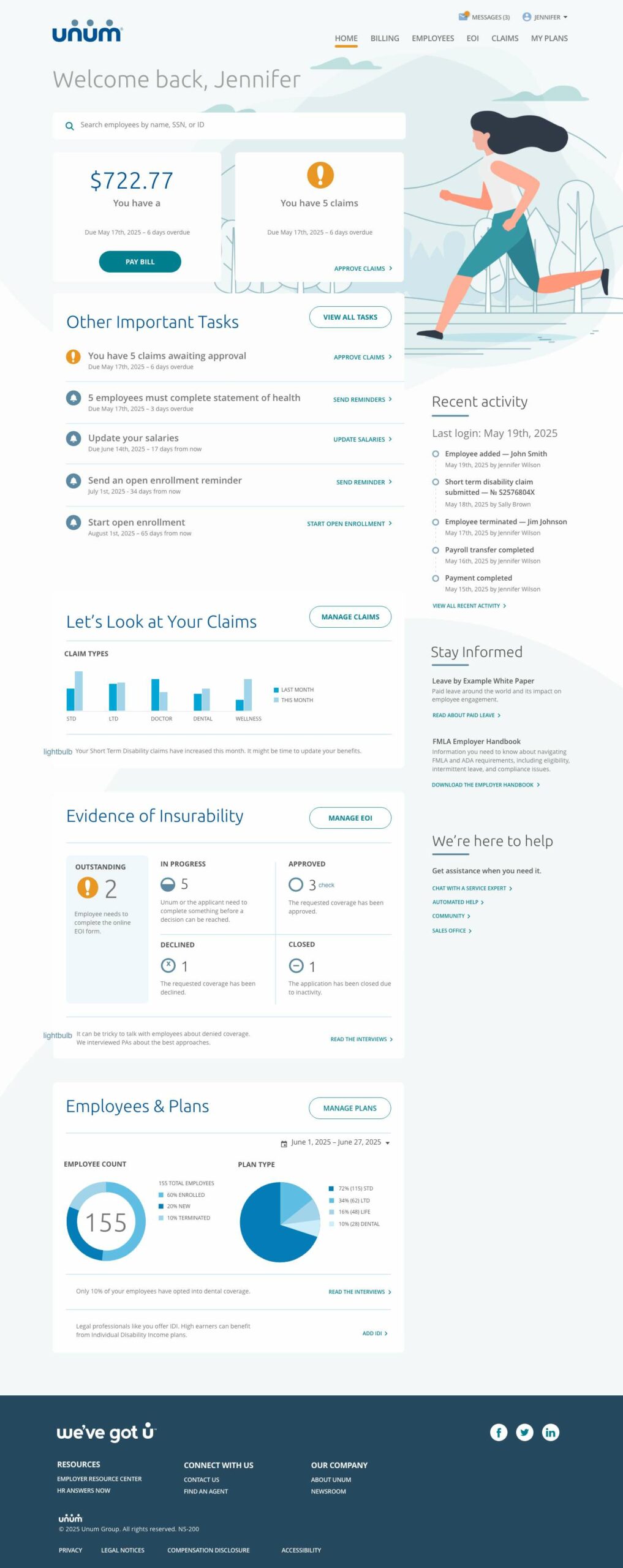
The central structural decision was to organize the dashboard around a **triage model** rather than a list model. Instead of displaying all claims in a single queue, the new design divided the supervisor’s view into three distinct zones: The number of open Claims, important tasks (next steps) & claim management
This three-zone model immediately addressed the most critical piece of feedback from our research: that supervisors were spending too much time hunting for what needed their attention. Under the new structure, the answer to “what do I need to do today?” was visible the moment the page loaded.
We also redesigned the claim detail view as a persistent side panel that remained open across sessions, displaying the full claim history, adjuster notes, document attachments, and status timeline in a single scrollable view. The panel used a tabbed structure to separate communication history, financial details, and compliance notes — information that previously required navigating to separate screens.
The reporting experience was reimagined as an embedded feature of the dashboard rather than a separate module. A persistent “Reports” panel in the right rail allowed supervisors to generate common report types — daily caseload summaries, adjuster performance snapshots, escalation logs — with a single click, using the filters already applied to their current view. Custom date ranges and export formats were available as secondary options without being the first thing a user had to interact with.
Prototyping and Usability Testing
We built high-fidelity designs and brought it back to the supervisors usability testing in order to provide a fresh perspective.
Testing sessions were moderated and task-based. We asked participants to complete realistic scenarios: identify the three claims most urgently requiring attention, review an adjuster’s caseload, generate a compliance report for the previous week, and onboard a newly assigned claim. We measured task completion rates, time-on-task, and error rates, and captured qualitative feedback through think-aloud narration.
The results were largely positive, with several important refinements surfaced.
The triage model was immediately understood and appreciated by every participant. Multiple supervisors commented unprompted that they could “see what the day looks like” faster than they ever could in the existing tool. Task completion for the “identify priority claims” scenario dropped significantly.
The claim detail panel performed well for experienced users but created initial confusion for the two least-experienced supervisors, who weren’t sure whether the panel represented a separate workflow or a summary of something they had already done. We responded by adding a clearer panel header with contextual breadcrumb and a visible close affordance, and by adding a brief animated entrance that made the panel’s relationship to the selected claim more legible.
The Final Design: Key Outcomes
After two rounds of iteration following usability testing, we delivered a final design system and annotated specification to the client’s internal development team. The redesigned dashboard included:
A **priority-first layout** that surfaces claims requiring action without any manual filtering, giving supervisors immediate situational awareness at the start of every session.
A **unified immediate tasks** panel that consolidates all claim alerts — in a single persistent view, eliminating the need to navigate across multiple screens to build a complete picture of any single claim.
A **standardized status taxonomy** with consistent visual language (color, icon, and plain-language label) and inline contextual explanations that make claim state unambiguous for users at every experience level.
A **responsive layout** optimized for both the large desktop monitors used at office workstations and the laptop screens supervisors used when working remotely or in the field that’s intuitive and easy on the eyes.
A comprehensive **design system** with reusable components, interaction patterns, and accessibility specifications — ensuring that future additions to the dashboard can be built consistently without recreating the incremental design debt that had accumulated in the legacy product.
What We Learned
Every UX project teaches something that transcends the specific product, and this one was no different.
The most powerful insight from this engagement was how much the legacy interface had shaped users’ mental models of their own job. Several supervisors initially pushed back on the triage layout, not because they thought it was wrong, but because they had internalized the old system’s flat list model as the “correct” way to think about claim management. It took seeing the priority-first layout in a prototype — and experiencing how quickly it let them identify their most urgent cases — before those assumptions loosened. Designing against a legacy interface means designing against habit, and that requires showing people something that works, not just telling them it will.
The second lesson was about the relationship between information density and decision quality. The legacy dashboard had more data visible at once, and some supervisors initially equated that with usefulness. But more data without hierarchy is just noise. The redesigned dashboard showed less on the surface and made far more available on demand — and in testing, it consistently produced faster, more confident decisions. Good dashboard design is not about showing everything. It’s about showing the right things, in the right order, at the right time.
Looking Ahead
The redesigned claims supervisor dashboard is currently in phased rollout, with the first cohort of supervisors completing their onboarding to the new system. Early metrics are tracking ahead of the project’s targets, with reported time-to-decision on escalated claims down significantly and new supervisor onboarding time already showing improvement in the first two pilot groups.
For the claims supervisors who spent years managing by exception in a system that wasn’t built for it, the new dashboard isn’t just a better interface. It’s a tool that finally matches the sophistication of the work they do every day.
Interested in a UX audit or dashboard redesign for your organization’s internal tools? Get in touch to start a conversation.