First Serve: USTA Member Sign-Up & Sign-In Experience
April 29, 2026There’s a particular kind of irony in making something hard to join. The United States Tennis Association exists to grow the sport — to connect people to tennis, to each other, and to a lifetime of play. And yet, for a significant number of new users arriving at USTA.com with genuine intent to create an account, the sign-up experience was getting in the way of exactly that.
This project was about fixing that. It was about making the front door to the USTA’s digital ecosystem — the account creation and sign-in flow — feel as welcoming as the sport itself.
Understanding the Problem
Before any wireframe was drawn, we spent time understanding where and why people were abandoning the sign-up process. The data painted a clear picture.
Drop-off was concentrated at two moments: the initial registration form, and the email verification step. These aren’t surprising places to lose users — they’re the most cognitively demanding moments in any account creation flow — but the degree of abandonment signaled something more than expected friction. It signaled that the experience was asking too much, too soon, without giving users enough context for why the effort was worth it.
Qualitative research reinforced this. New users didn’t understand what they were signing up for. The value proposition of USTA membership — access to rankings, league play, coaching resources, and a network spanning 30+ websites and regional platforms — wasn’t surfaced until well after they’d already committed to creating an account. Or, in many cases, not at all.
Existing members signing back in faced a different but equally frustrating problem: inconsistent session management across the USTA’s ecosystem of sites meant that logging into USTA.com didn’t necessarily keep you logged in on affiliated properties. The sense of a unified membership identity was absent.
Our task was clear: design a sign-up and sign-in experience that was simpler, faster, more transparent about its value, and architecturally sound enough to work seamlessly across the full breadth of USTA’s digital properties.
Principles That Guided the Design
Before diving into flows, we aligned on a set of design principles that would govern every decision:
Progressive disclosure over front-loading. Ask for only what’s needed, when it’s needed. Don’t present a user arriving to create an account with a wall of form fields before they’ve taken a single action.
Clarity over cleverness. Error states, confirmation messages, and instructional text should be direct and specific. “Please enter a valid mobile number” is more useful than a generic red border.
Trust signals throughout. Account creation involves sharing personal information. The design needed to build trust at every step — through visible legal transparency, clear opt-in language, and consistent USTA branding.
Mobile-first, ecosystem-aware. With a significant portion of USTA’s growing audience accessing the platform on mobile, every interaction needed to be designed for thumb-friendly, small-screen use first — then scaled to desktop. And every component needed to work within the broader system of 30+ USTA properties.
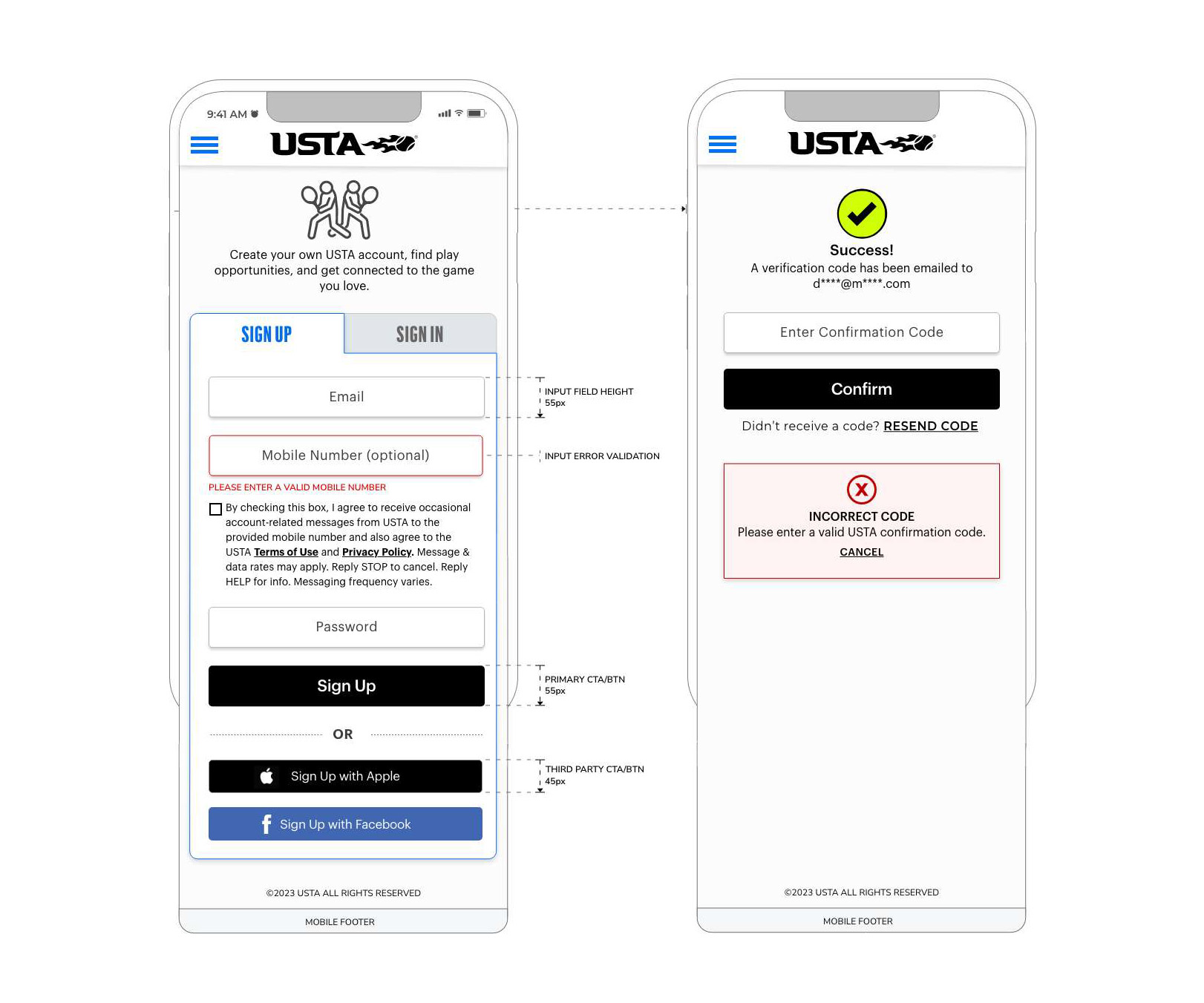
The Sign-Up Flow: Step by Step
Step One: The Entry Point
The redesigned initial sign-up screen strips the experience down to its essentials. Email address. Mobile number (optional). Password. Three fields.
This was a deliberate choice. Earlier versions of the registration form collected far more information upfront. Our research showed that users were more willing to complete a longer form once they’d already taken a first step — once they’d crossed a small psychological threshold of commitment. By reducing the entry-point form to its minimum viable ask, we significantly improved the completion rate on this first screen.
The Sign Up / Sign In toggle at the top of the form gives returning users an immediate escape hatch — no need to navigate away or second-guess which page they’ve landed on.
Third-party authentication options — Sign Up with Apple and Sign Up with Facebook — were elevated to prominent, clearly labeled CTAs, sized and styled to match their brand guidelines while remaining visually distinct from the primary USTA Sign Up button. The visual hierarchy here was intentional: the primary USTA path is visually dominant, but the social sign-in options are genuinely accessible, not buried.
Every component was annotated with precision for the development team: input field height at 50px, primary CTA button height at 50px, third-party CTA buttons at 45px. These specifics weren’t arbitrary — they reflect touch target accessibility standards and ensure consistent tap affordance across devices.
The Mobile Opt-In: Consent Done Right
The optional mobile number field deserved particular care. USTA uses mobile for account-related messaging and, with user consent, for marketing communications. Getting the consent language right — both legally and experientially — was a collaborative effort with USTA’s legal and compliance teams.
The resulting design includes clear checkbox opt-in language that explains exactly what a user is agreeing to: occasional account-related messages, with explicit instructions to reply STOP to cancel and HELP for support information. This language is visible directly adjacent to the mobile number field, in context, rather than hidden in a terms document. It’s a small design decision with significant trust implications.
Email Verification: Designing for the Real World
The verification step is where many sign-up flows lose users — and it’s easy to understand why. You’re asking someone to pause, switch to their email app, find a message that may or may not have arrived yet, and manually copy a code. Every second of that journey is an opportunity for drop-off.
Our redesign approached this screen with empathy.
The success state leads with a clear visual confirmation — a prominent checkmark, a “Success!” headline, and a plain-language explanation of what just happened and what comes next. The email address the code was sent to is partially masked but visible, giving users immediate feedback that the right address was used.
The confirmation input is clean, prominent, and supported by a clearly labeled Confirm button. Below it, “Didn’t receive a code? Resend Code” is an explicit, actionable fallback — not a buried support link, but a first-class recovery path.
The error state was given equal design attention. When a user enters an incorrect code, the response is immediate and specific: a red-bordered error module, clearly labeled “Incorrect Code,” with plain-language instructions to enter a valid USTA confirmation code and a Cancel option. No ambiguity. No generic error icons. Users know exactly what went wrong and exactly what to do about it.
This level of specificity in error design reflects a broader philosophy: error states aren’t edge cases to be handled minimally. They’re critical moments in the user journey where the design either recovers trust or loses it.
Registration Completion: The Second Act
Once email is verified, the experience shifts. A green “Email Confirmed!” confirmation banner at the top of the screen acknowledges the user’s effort and signals progress. Then, and only then, does the full registration form appear.
This sequencing was one of the most impactful structural decisions in the project. By staging the form collection — basic credentials first, then verification, then profile completion — we transformed what was previously a single overwhelming page into a journey with clear, achievable steps.
The registration completion form collects:
Personal Identity — First name, last name, and date of birth. The date of birth field is particularly important in the USTA context, as it determines competitive age group eligibility and certain membership restrictions. A tooltip help icon adjacent to the field provides contextual explanation without cluttering the form.
Gender Competition Category — A radio button selection between Male and Female, with a tooltip help icon providing context about how this designation affects competitive play. The labeling and framing here required careful iteration with the USTA’s sport governance teams.
Nationality — A dropdown selector that affects certain competitive eligibility criteria for USTA-sanctioned events.
Communication Information — Country and ZIP code fields, which enable the location-based personalization features across USTA.com and affiliated sites.
The form closes with a Create Account CTA and a Cancel link — both clearly available, giving users agency throughout.
Designing for Help: Tooltips in Context
One of the more thoughtful additions to the registration form was the tooltip system — a set of contextual help overlays triggered by the help icons adjacent to specific fields.
The tooltip design was driven by a real user need: certain fields in the registration form — particularly Date of Birth and Gender Competition Category — generated significant confusion and support contacts. Users didn’t understand why this information was being collected or how it would affect their experience.
The tooltips solve this without adding friction to the default path. They’re invisible to users who don’t need them, and richly explanatory for those who do. Each tooltip opens inline, positioned contextually near the field it references, with enough space for a paragraph of explanatory text. A clear close control dismisses it without disrupting form state.
This pattern — ambient help, available on demand — became a system-level component that extended beyond registration into other high-complexity forms across USTA’s platform.
Design System Thinking: Built for 30+ Properties
One of the most important non-visible deliverables of this project was the component library that underpinned it.
Every element in the sign-up and sign-in flows — input fields, buttons, error states, confirmation banners, tooltips, toggle controls — was designed as a reusable, documented component. Each component was built with defined states (default, hover, active, error, disabled), consistent spacing tokens, and clear usage guidelines.
This mattered because USTA.com is not a single product. It’s a platform. The same registration and authentication experience needed to function coherently across regional section sites, the USTA League platform, Junior Tennis portals, pro circuit pages, and more. A component system was the only scalable answer.
The system also addressed one of the more subtle pain points identified in research: the sense among existing members that they were “logging in again” whenever they moved between USTA properties. While the full solution to unified session management was an engineering effort, the design system provided the visual and interaction consistency that made the experience feel unified — a necessary complement to the technical work.
The Before and After
The differences between the original experience and the redesigned flows weren’t always dramatic on paper. Many of the changes were incremental: a form field moved, a label rewritten, an error state made specific, a button resized. But the cumulative effect was substantial.
Users completing the sign-up process described the new experience as “faster,” “cleaner,” and notably, “more trustworthy.” The explicit consent language around mobile opt-in, rather than reducing sign-up rates, actually increased user confidence — people felt more comfortable sharing their phone number when they understood exactly how it would be used.
Verification code completion rates improved significantly once the error states and recovery paths were clarified. And the staged form collection — entry credentials first, profile completion after verification — measurably reduced abandonment at the registration form stage.
What We Learned
This project reinforced several things we believe deeply about the practice of UX design.
The smallest moments carry the most weight. An error message nobody thinks to write carefully, a tooltip nobody thinks to design, a form label that assumes too much prior knowledge — these are the moments that define whether a product feels considered or careless. The USTA’s members include first-time app users and lifelong tennis players, tech-native teenagers and senior recreational players. Every interaction needed to work for all of them.
Trust is designed, not assumed. In an era of data breaches and privacy anxiety, users don’t give their information freely. They give it in exchange for trust — trust that the organization will use it appropriately, explain it clearly, and protect it carefully. Design is one of the most powerful instruments for building that trust.
Consistency at scale is a design problem. With 30+ properties in the USTA ecosystem, the answer to consistency wasn’t “make everyone follow the rules.” It was “build a system that makes the right thing the easy thing.” A well-designed component library with clear documentation does more for cross-property consistency than any style guide.
Closing Rally
Redesigning the USTA’s sign-up and sign-in experience was, in many ways, a project about respect — respect for users’ time, respect for their attention, and respect for the commitment it takes to create an account on one more platform.
When the experience works, users don’t notice it. They sign up, confirm their email, complete their profile, and get to the part they actually came for: finding a court, registering for a league, connecting with the sport they love.
That invisibility is the goal. And when you get it right, it’s one of the most satisfying things you can design.


