Reimagining Global Navigation for the USTA
April 28, 2026The Starting Line: Understanding the ScopeUSTA.com is the central node connecting recreational players looking for local courts, elite coaches managing training programs, pro circuit followers tracking tournament results, new members signing up for the first time, and existing members managing their accounts and rankings. Every one of these users arrives through the same front door.
Our audit revealed that the existing navigation was doing the bare minimum — a flat, category-driven structure that made sense on paper but broke down in practice. Users were abandoning paths mid-journey. Members couldn’t quickly access their dashboards. New visitors had no clear onboarding signal. And across the 30+ satellite sites — from USTA Sections (regional organizations) to USTA Leagues, Junior Tennis, and the Pro Circuit — the experience was inconsistent and disconnected.
The brief was ambitious: design a navigation system that could serve all of these audiences, scale across the full ecosystem, and still feel clean and intuitive.
Mapping the Terrain: Research & Discovery
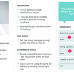
We started where every good UX project starts — listening. Through stakeholder interviews, user surveys, and session recordings, a few consistent pain points emerged:
For recreational players, finding local tennis resources — courts, programs, finding a coach — required too many clicks and too much prior knowledge of how USTA was structured. The organization’s depth was invisible.
For members, the sign-in experience was buried, and post-login, the dashboard felt disconnected from the broader site. There was no sense of “your world within USTA.”
For new visitors, the lack of a clear onboarding path — particularly around membership benefits and joining — meant significant drop-off at exactly the moment conversion mattered most.
For coaches and organizers, the density of resources under “Coach & Organize” was significant, but the taxonomy was opaque. Key tools like the Tennis Tool Center, officiating resources, and training materials were hard to surface.
For pro tennis followers, the distinction between the USTA’s own pro properties and coverage of the broader tour was muddled, creating confusion about what the organization actually offered.
The Design Approach: Mega-Menu Architecture
After several rounds of card sorting, tree testing, and content auditing, we landed on a mega-menu architecture — a solution that would allow us to expose the full depth of USTA’s offerings without requiring users to drill down through multiple pages just to find what they were looking for.
The mega-menu isn’t a new pattern, but executing it well requires discipline. Done poorly, it becomes a wall of links. Done right, it becomes a mapped landscape — one that gives users confidence about where things live, even if they’re visiting for the first time.
Five Primary Navigation Pillars
We organized the global navigation around five content domains that emerged directly from our user research:
About USTA — The organizational story: membership tiers, USTA Connect, Ventures, Sections, and the geographic section map. Designed to orient new visitors and serve as a reference for anyone wanting to understand the full scope of the organization.
Play Tennis — The heart of what USTA does. This mega-menu became the most complex to design, housing everything from Health Benefits of Tennis and Age Group programs to USTA Rankings & Standings, Find Local Tennis, Tips & Podcasts, Player Parents resources, and the USTA App. We used visual hierarchy and grouping to prevent cognitive overload, keeping the most-accessed items — like Find Local Tennis and USTA Leagues — visually prominent.
Coach & Organize — A dedicated space for the teaching professional and program administrator. Organized around Coaches, Organization & Facilities, Tennis Support, the Tennis Tool Center, Tips & Podcasts (with a different, coach-specific lens), and Officiating. A persistent link to the Resource Library was added based on direct feedback from USTA-certified coaches.
Pro Tennis — Streamlined to focus on what USTA’s pro ecosystem actually delivers: Pro Tennis Events, the Pro Tennis Circuit, and Pro Tennis News. Clean and purposeful, serving a more news-and-results-oriented audience.
Tennis News — A persistent, high-level entry point for news across all of the above domains.
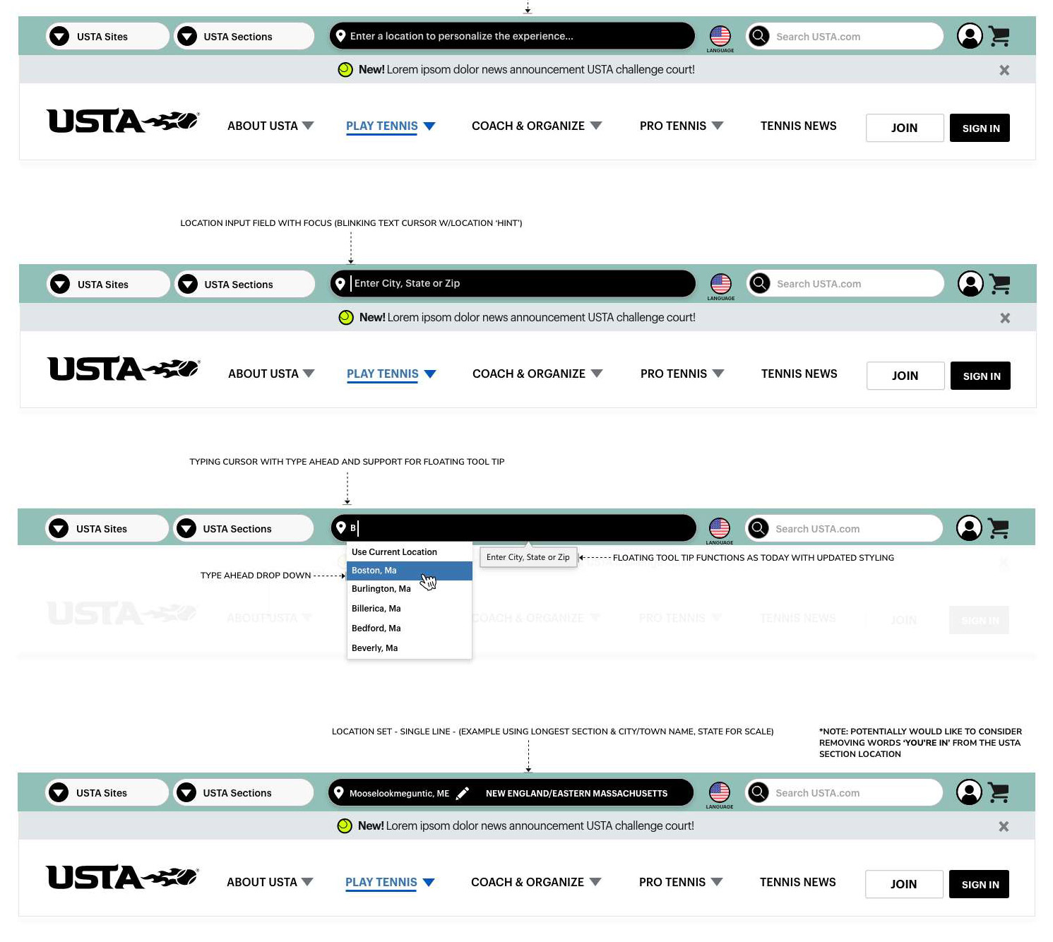
The Utility Bar: Serving Complexity at the Top
One of the more nuanced design decisions involved the top utility navigation — the tier above the primary nav. USTA’s organizational structure includes a network of regional sections, each with their own digital presence. Users often needed to move between USTA.com and their regional section’s site fluidly.
We designed a persistent utility bar with two key affordances:
USTA Sites & USTA Sections — tabbed quick-access to the broader network of USTA properties, allowing users to navigate laterally across the ecosystem without losing context.
Location Personalization — a prominent “Enter a location to personalize the experience” input that, once set, would surface locally relevant content (nearby courts, regional programs, local section news) throughout the site. This was a significant enhancement: making the experience feel personal and relevant rather than nationally generic.
Search — elevated and persistent, with improved autocomplete and result scoping across the full USTA content ecosystem.
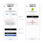
Designing for Member State: A Tale of Two Experiences
One of the most impactful decisions in the project was designing explicitly different navigation states for logged-in members versus anonymous visitors.
For logged-out users, the navigation surfaces Join and Sign In as clear, persistent calls to action. Membership benefits are woven into the mega-menus contextually — you encounter the value of membership as you explore, not just on a dedicated join page.
For logged-in members, the experience shifts. The utility bar surfaces account context, and the navigation anchors shift subtly to support a member’s more task-oriented mindset: managing rankings, accessing member tools, viewing account information, and navigating the dashboard.
This dual-state design required close coordination with the membership platform team to ensure the experience was genuinely differentiated — not just a cosmetic badge swap.
The Announcement Banner: A Flexible Communication Layer
Sitting between the utility bar and the primary navigation, we introduced a dismissible announcement banner — a flexible communication channel for USTA to surface timely messages: challenge court announcements, news items, program launches, or seasonal promotions.
The design kept it intentionally minimal: a single line of text, a clear dismiss control, and enough visual separation from the navigation chrome that it reads as content rather than furniture. This small addition addressed a real operational need the content team had been navigating around for years.
Iterating Toward Clarity
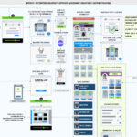
The design process was genuinely iterative. The working iterations documented in our ideation files show how significantly the mega-menu layouts evolved — from early versions that tried to do too much in each panel, to more focused, grouped structures that emerged through usability testing.
A few key lessons from the iteration process:
Third columns are contextual, not default. Early designs used three-column layouts across all mega-menus. Through testing, we found that introducing a third column only when genuinely needed (Play Tennis, with its wider content scope) and keeping other menus to two columns resulted in lower cognitive load and faster task completion.
Icons as anchors, not decoration. Each top-level content group in the mega-menus is marked with a simple icon — a visual anchor that helps users scan and orient quickly. These aren’t decorative; they’re functional landmarks. Testing confirmed that users identified sections faster with iconographic anchors than without.
Announcements belong between, not within. Multiple iterations tried placing announcement content inside the mega-menu panels. Users consistently ignored it. Moving the announcement to a dedicated banner layer, outside of the menu, resulted in dramatically higher notice and engagement.
Scaling to 30+ Sites: A System, Not a Template
Perhaps the most challenging aspect of this project wasn’t designing the navigation itself — it was designing a navigation system that could work at scale.
The USTA’s 30+ websites include regional section sites, sport-specific microsites, and program-specific pages. Each has its own content needs, branding nuances, and audience. Our navigation framework needed to function as a true design system: opinionated enough to create coherence across the network, flexible enough to accommodate variation.
We delivered a component library with clearly documented usage guidelines, covering everything from the mega-menu grid system and icon conventions to the mobile-responsive behavior of the utility bar, the accessibility requirements for keyboard navigation, and the member-state logic governing which elements appear when.
For USTA’s in-house development team, this represented a meaningful shift: from one-off builds to a governed system with shared primitives.
The Outcome
The redesigned navigation launched to measurable improvements across the board. Users were finding local tennis resources faster. New member sign-up conversion improved as the journey became clearer and more intentional. Existing members reported higher satisfaction with their ability to access account features quickly. And USTA’s content teams gained a flexible, maintainable communication layer they hadn’t had before.
More broadly, the project established a navigation and IA foundation that the organization could build on — as their content grows, as new programs launch, and as the broader USTA digital ecosystem continues to evolve.
Reflections
A project like this is a reminder that navigation design is, at its core, information architecture — the practice of organizing complexity so that people can find their way. The USTA’s content wasn’t the problem. The game plan, the community, the resources — they were all there. Our job was to make them discoverable.
Tennis is a sport about precision, reading the court, and knowing when to be aggressive and when to hold back. In some ways, that’s not a bad frame for UX design either. Know your users. See the whole court. Make every element earn its place.


