One look. One answer. Designing the US Open practice schedule for the players themselves.
May 1, 2026For two weeks each summer, the US Open is the busiest tennis facility on the planet. Hundreds of practice sessions move across more than a dozen courts, schedules shift hour by hour, and the players walking onto those courts — from top seeds to qualifiers — need a single, reliable answer to a single question: where am I, and when. Our brief was to redesign the practice schedule application for that audience: not the fans in the stands, but the competitors themselves.
The brief
The legacy practice schedule had been built, sensibly, the way most schedules get built: as a table. It worked at a desk and on a tournament-operations laptop, but it broke down where players actually used it — on a phone in the locker room, on a tablet held by a coach, on a digital sign in a hallway. Information was there but not glanceable; updates were correct but not legible at speed. The USTA asked us to build something different: a responsive, scalable component that could carry a player’s next session at any resolution, on any device, without ever looking like a database.
An unusual audience
Most sports products are built for fans. This one wasn’t. We spent time with players, their coaches, hitting partners, and the operations team that physically schedules the courts. What we heard from the players themselves was unanimous and unsentimental: they don’t want to read a schedule, they want to confirm one. They check the app to verify a court assignment in the thirty seconds between leaving the locker room and walking through the player tunnel. They check it again with a coach to confirm a hitting partner showed. They check it from a phone, sometimes one-handed, sometimes in bright sunlight, sometimes with their racquet bag on their shoulder.
A schedule for athletes isn’t a list. It’s a single sentence at the top of a page, written in a typeface that survives sunlight and motion.
The component, not the screen
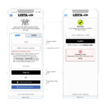
We approached the redesign as a component problem rather than a screen problem. Every practice session shares the same anatomy — a time, a court, a set of players — but the surrounding context shifts constantly: the same data has to render on a phone home screen, on a tablet view of the day’s schedule, on a hallway display, and inside operational tooling used by USTA staff. So we designed a single Player Module: a horizontally banded card with three tabs — TIME, COURT, PLAYERS — sized to the smallest viewport that mattered and written to scale up cleanly from there.
The TIME tab anchors the card on the left, set in a heavy display weight so the start time is the first thing the eye lands on. The COURT tab sits beside it, calling out the practice court (P1, P4) in an inverted block that’s legible at a glance even when the card is small. The PLAYERS tab carries the people: name, country flag, and ordering, with consistent gutter padding so a four-player session and a two-player session sit together without looking like different objects.
Variable data, governed by rules
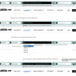
The hardest part of this work wasn’t visual — it was governing what the component does when reality doesn’t cooperate. Tennis schedules are inherently messy: a hitting partner is sometimes confirmed an hour before the session; a coach occasionally joins a four-player practice as a fifth body; a doubles partner is, briefly, just “TBD.” We wrote a small set of rules into the component itself.
A session with two players uses the same module footprint as a session with four; the spacing adjusts, but the card doesn’t shrink. When a slot isn’t yet filled, the module displays a TBD player with a default tennis-ball mark in place of the country flag, never an empty slot. When a coach joins a four-player session, a small “+1” indicator hangs off the right edge of the card, flagging the additional body without restructuring the module. Every variant looks like the same thing because, structurally, it is.
Rule one: never show an empty slot. A blank reads as a bug; a labeled TBD reads as a schedule that’s still being finalized. The same data — an unfilled slot — tells a completely different story depending on how the component handles it.
Responsive across the venue, not just the device
The component had to work on the device a player held, but also on every other surface the USTA used during the tournament: hallway displays, operations dashboards, the player portal on desktop, and embedded views inside coach-facing tools. We delivered a single specification with breakpoints and scaling behavior that hold the same anatomy across each context. The same module that fits in a phone’s home-screen widget renders, untouched in concept, on a 65″ hallway monitor. Players see one consistent unit of information regardless of where they happen to be looking.
A typography choice that does real work
The decision that mattered most, surprisingly, was typographic. We set the TIME and COURT values in a condensed display weight with strong vertical proportions, deliberately heavier than anything else on the surface. In testing, this single move — making the time and court visually unmistakable — reduced the time it took a player to confirm their next session from several seconds to roughly one. For an audience that often glances at the schedule with a racquet in hand, that was the headline win.
Outcome
The redesigned Player Module shipped as the foundation of the US Open practice schedule experience and is now part of the USTA’s broader product design system. It works on a phone, on a tablet, on a digital sign, and inside tournament operations tooling, with a single shared anatomy and a small set of rules that handle the messy edges. More than any single visual decision, the lasting deliverable is the discipline behind it: a player-facing component designed for the way athletes actually use a schedule — quickly, in motion, and with no patience for ambiguity.


