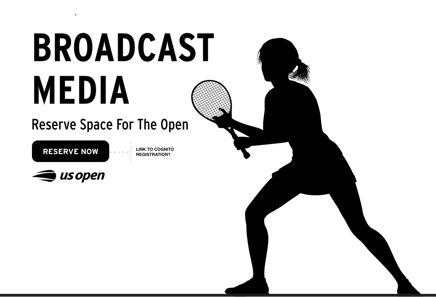
A press box, made digital: designing the US Open Media Portal.
May 1, 2026For the broadcast crews and press who cover the US Open, the tournament moves at the speed of a live cut. A producer at ESPN needs the highlight from the Ashe night session by the next break. A photo editor needs an approved image of a Round-of-16 winner before the print deadline. A writer needs the right player’s biography ten minutes before they walk into the interview room. Our brief was to design a single, authenticated portal that gave those professionals everything they needed, instantly — and stayed out of their way the rest of the time.
The brief
The US Open had long supplied broadcast media and press with the assets they needed to do their jobs — video clips, high-resolution images, media guides, statistical PDFs, interview transcripts — but the surfaces those assets lived on had grown over years of incremental additions. Photographers used one tool, broadcast crews used another, and writers downloaded media guides from a third. The USTA asked us to consolidate that scattered toolset into one portal: a single, authenticated home for everything credentialed media might reach for during the two-week tournament.
An audience that lives on a deadline
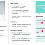
We started by spending time with the people who would actually use the portal. What we heard from broadcast producers, sports photographers, reporters, and rights-holder coordinators was consistent and bracing: media users don’t browse, they hunt. They arrive at the portal knowing exactly what they need and they need it now. They’re often working from a press tribune with two screens, a phone, and a deadline counted in minutes. They have no patience for decorative interfaces. The portal’s job, we concluded, was to feel less like a website and more like a well-organized desk.
Media users aren’t looking for a great experience. They’re looking for the file. Anything between them and the file is an obstacle.
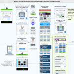
A spine of seven destinations
We organized the entire portal around a fixed left rail with seven anchors: Home, Users, Images, Videos, Media Guide, Media Operations Guide, and PDF Archive. The rail is intentionally simple and never moves — a credentialed user who learned its order on day one can navigate the portal blindfolded by day three. The Home view aggregates the most-needed content of the moment: a featured video preview, a newest-PDF rail, and a featured-image grid, each linked directly to the deeper section. Every other destination is a focused collection: just videos, just images, just media guides. We kept that discipline ruthlessly. A portal that tries to be a magazine ends up being neither.
Time, weather, and the shape of a tournament day
A US Open day isn’t shaped like a normal calendar day. It’s shaped by weather, by court availability, and by which matches actually finish. We built a contextual status strip across the top of every screen carrying the three things media users said they checked first thing in the morning: the current local time on site, the day’s weather conditions, and a live alert about whether the player schedule had been disrupted. A weather icon and a single plain-English status (“Partly Cloudy — NO CHANGES TO PLAYER SCHEDULE”) replace the half-dozen tabs reporters used to check separately. The strip is also where we left a hook for richer weather data on future tournament dates — a small piece of forward planning that helps a producer decide whether tomorrow’s outdoor session is worth pre-booking a crew around.
A calendar that’s really an index
The most-used component on the portal turned out to be the date selector. Media users almost always need content from a specific match day — not the current day, but Wednesday’s Round of 16, or last Friday’s qualifying win. We replaced the standard single-date calendar with a date-range picker spanning the tournament window, allowing a single click to pivot the entire portal to a chosen day or stretch of days. Selecting Wednesday, May 24th reframes the homepage’s featured video, image grid, and PDF rail to that day’s assets. The calendar isn’t a date input — it’s the portal’s primary filter.
Video, the way producers actually use it
The featured video player carries match highlights, interview-room footage, and broadcast B-roll. We designed it for a 16:9 aspect ratio (the broadcast standard) and gave it a deliberately generous frame, with a primary “Download Full Video” button that delivers the master file directly. Producers told us the speed-bump they hated most was previewing in one tool and downloading in another, so the player and the download live in the same surface. Videos carry consistent metadata: title, date, length, rights status. Nothing decorative.
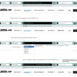
Images and PDFs, treated like a working library
The Featured Images grid and the PDF Documents table sit side by side on the homepage and function as miniature versions of their dedicated sections. Each image carries the date it was added, a clear download action, and a preview action that doesn’t make the user open a new tab to confirm they’ve found the right shot. The PDF table follows the same logic: file name, owner, date added, and two actions — preview and download — surfaced inline. Users who’ve searched a hundred files don’t want a card layout; they want a table they can scan with their finger.
Design decision: we treated “preview” and “download” as first-class siblings, not nested actions. Every preview reveals the file in place. Every download delivers the file at full resolution, with no second click. The portal’s reputation lives or dies in those two icons.
Admin tooling, in the same room
The portal also serves the USTA’s media operations team. Rather than build a separate admin app, we carved out a 25% column on the homepage labeled ADMIN ONLY, visible only to authorized staff. From that column, ops users can review newly registered media members — with photo, country, and credential status — approve or remove them, and jump into the Users section for deeper account management. Keeping admin tooling inside the same shell as the media-facing portal meant the operations team saw exactly what their users saw, every day, without context-switching.
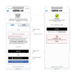
Authorization, treated as table stakes
The portal is gated. Broadcast and press members log in against a credentialing system, and content is scoped by their role and rights. We designed the login and session experience to feel calm rather than punitive: clear states for “welcome,” “your credential expires soon,” and “please re-authenticate,” with no surprise lockouts in the middle of a download. For working media on a deadline, predictable authentication is the difference between a portal they trust and one they route around.
Outcome
The US Open Media Portal now serves as the canonical surface for credentialed media during the tournament: a single login, a single navigation, and a single source of truth for video, images, statistics, and operational documents. Media users reach the asset they need meaningfully faster than they did across the legacy toolset, and the USTA media operations team manages registrations and content from the same shell that the media members themselves see. The portal does what good newsroom tools always do: it disappears, and lets the people using it focus on the story.