



Teaching money, gently: building DCU’s Learning Center.
April 30, 2026DCU has always invested heavily in member education — financial literacy is a foundational pillar of credit-union identity — but the educational content was scattered across product pages, PDFs, third-party partner sites, and a long-running consumer column called StreetWise. From a member’s point of view, learning about a loan, a budget, or a refinancing decision required knowing where to look. Our charge was to consolidate this body of work into a Learning Center: a single, calm front door for everything DCU teaches.
One front door, many ways in
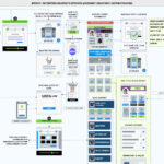
The first move was strategic, not visual. We mapped the existing content against the questions members were actually asking and discovered that audiences split cleanly into four learning modes: readers (who wanted articles), watchers (who preferred video), listeners (who trusted the experience of other members), and verifiers (who needed to confirm policies and disclosures). Rather than force a single hierarchy on these audiences, we built a layered page where each mode has its own anchored neighborhood — Financial Education at the top, Member Resources in the middle, Featured Videos below, and Policy Information at the foot — with a unifying search and filter so that any member could pivot horizontally across the body of content.
We didn’t want one canonical path. We wanted a building with several open doors.
Designing for the member, not the marketing calendar
A common pitfall of educational hubs is that they get curated by what the institution most recently published, not by what the visitor most needs. We fixed that with a content rail at the top of the page — “What Our Members Are Saying” — that surfaces real testimonials from DCU service representatives and the members they’ve helped. Two adjacent tiles spotlight StreetWise Consumer Education and a rotating editorial card. The effect is a homepage that opens with people, not products: a quiet signal that this is a learning destination, not a sales funnel.
Articles, treated like a magazine
DCU’s editorial library spans hundreds of pieces, from “How to Calculate Debt-to-Income Ratio” to “Tips for First-Time Buyers.” We commissioned a custom illustration system — rocket-bulbs, hexagonal charts, planning calendars, hand-drawn iconography — so that the article rail could carry visual variety without falling back on stock photography. The illustrations do real work: they signal subject matter at a glance and give an otherwise text-heavy page the tactile feel of a well-edited magazine. Each card carries a clear title, a short description, and a consistent footprint, which lets us scale the library without redesigning the page.
Video as a featured experience, not a bolt-on
Self-help videos were given their own room in the layout, with a wide player and a deliberately generous frame. Members who arrive in “watch” mode get an immediate, high-quality entry point rather than a tile buried four scrolls below the hero. We built the video module to support chaptering and transcript-on-demand, both of which extend the educational value of the content without adding visible weight to the page.
Member Resources: practical, not promotional
The DCU Member Resources block solves a small but stubborn problem: members often want to find a single document — a New Members Guide, a financial advisor’s column, a procedural how-to — and end up clicking through navigation menus to get there. We grouped these reference materials into a discrete card cluster with its own visual treatment: a small editorial column on the left, a featured guide on the right, and an illustrated companion image (the now-familiar “tree of books”) that gives the section a recognizable character across the site.
Policy Information, brought into the daylight
Compliance content normally lives in the basement of a financial site — PDF-only, dense, and rarely updated. We argued that policies are educational content, too: members who read the Funds Availability Policy, for example, are usually trying to understand how their own money moves. The Learning Center surfaces these documents in plain HTML, with summary copy beside the formal language, and a warm lifestyle photograph that signals the section is for members, not for lawyers. The compliance content didn’t change. The relationship to it did.
A search bar that earns its place
At the very top of the page, “View content by” and a keyword field let members cut across the entire library: by content type, by topic, or by free text. Because the page is built from a unified taxonomy, a member who searches for “auto loan” finds articles, videos, testimonials, and policies in a single result set. That horizontal indexing is what makes the Learning Center function as a true hub rather than a navigational menu.
Outcome
The Learning Center now sits behind a single tab — Learn — in DCU’s primary navigation, and serves as the canonical surface for every educational asset the credit union publishes. Time-on-page roughly doubled against the legacy education landing page, and the share of members who moved from a learning piece to a relevant product page (a loan calculator, a checking application, a refinance flow) increased meaningfully. The hub also gave DCU’s editorial team a home to publish into — a structural change that, more than any single design choice, is what makes the Learning Center likely to keep paying off.