Building the Single Source of Truth: Creating a Corporate Design System for Digital Federal Credit Union
May 7, 2026DCU serves over 900,000 members across all 50 states, with digital channels carrying the weight of most member interactions — from checking balances and applying for loans to enrolling in new products and managing account preferences. The digital experience isn’t a supplement to the branch; for most members, it is the branch.
Yet the teams building that experience were working without a shared visual and interaction language. A button styled one way in the loan application flow looked different on the marketing landing page. Form inputs in the member dashboard behaved differently than those in the enrollment wizard. Dropdown menus, radio buttons, sliders, and toggles had each been built independently — sometimes multiple times — with subtle but cumulative inconsistencies that eroded trust and increased cognitive load for members navigating across touchpoints.
For engineers, the duplication meant maintaining redundant code. For designers, it meant reinventing components from scratch on every project. For members, it meant a digital experience that felt less like a coherent product and more like a patchwork of microsites.
Something had to change.
The Design System Philosophy: Component-First, Context-Aware
From the outset, the DCU UX team made a deliberate choice: this would not be a static PDF style guide that lived in a shared drive and was ignored within six months. It would be a living toolkit — modular, documented, versioned, and designed to serve two distinct audiences simultaneously: the design team and the engineering team.
The guiding principles were:
Consistency without rigidity. The system needed to enforce visual and behavioral coherence across products, but it also needed to accommodate the real-world variation between DCU’s application contexts — transactional banking interfaces demand precision and restraint, while promotional and marketing pages call for more expressive, conversion-oriented treatments.
Documentation as a first-class deliverable. Every component would ship with usage guidance: when to use it, when not to, what variations exist, and how it behaves across states (default, focus, filled, error, disabled). The toolkit would be self-explanatory to a developer who had never attended a design review.
Legacy-aware, future-forward. DCU’s existing digital products couldn’t be rebuilt overnight. The system needed to acknowledge legacy patterns, provide clear migration paths, and give teams the confidence to modernize incrementally rather than all at once.
What We Built: A Tour of the Toolkit
The DCU Digital Style Guide & Toolkit is organized into distinct layers — from atomic form elements to complex interaction patterns — each documented with visual specifications, behavioral states, and annotated usage guidelines.
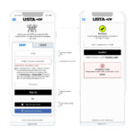
Input Form Elements
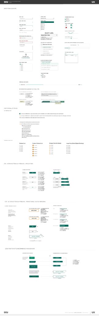
Forms are the workhorses of any financial services digital experience. Members fill them out to apply for loans, update contact information, set up transfers, and enroll in new products. Getting forms right — visually, behaviorally, and accessibly — was non-negotiable.
The toolkit defines the full hierarchy of input states: default, focus, filled, required, and error. Each state has a distinct visual treatment so members always know where they are and what the system expects of them. Input labels sit above the field in all states, eliminating the ambiguity of placeholder-only patterns. Required fields are explicitly marked. Error states surface inline, with actionable feedback rather than generic alerts.
The system also addresses specialized input types — upload fields with drag-and-drop affordances, multi-select inputs, and type-ahead search — each documented with interaction details and accessibility considerations to ensure keyboard and screen reader compatibility.
Select Labels and Dropdown Controls
Dropdown menus appear throughout DCU’s transactional and application flows, and the toolkit addresses them with precision. Standard selects, multi-option selects, and calculator-themed select controls (used in product comparison and rate estimation tools) each have their own documented component with clear state definitions: unselected, open, option highlighted, and option selected.
The distinction matters in context. A loan application dropdown asking a member to select a loan term is a high-stakes interaction — the design needs to be unmistakably clear. The toolkit ensures that clarity is built in, not left to individual implementation.
Checkbox and Radio Group Labels
The system distinguishes cleanly between checkbox groups (for multi-select scenarios) and radio button groups (for mutually exclusive selections), providing consistent label positioning, spacing, and selected-state styling across both. Toggle controls — for enable/disable product features such as card controls, notification preferences, and Round It Up enrollment — are treated as a distinct component with their own visual language, separate from standard form checkboxes.
Slider controls, used for interactive features like savings calculators and rate estimators, are fully specified with track, thumb, active, and disabled states — including the often-overlooked challenge of slider behavior on touch devices.
Information Elements and Tool-Tips
In financial services, members frequently encounter terminology, disclosures, and product details that require contextual explanation. The toolkit provides a standardized set of information elements and tool-tips — inline help text, icon-triggered overlays, and progressive disclosure patterns — designed to surface the right amount of information at the right moment without cluttering the interface.
These components are documented with two contexts in mind: pre-application informational views (where a member is learning about a product) and in-application instructional views (where a member is in the middle of a task and needs help without losing their place).
Content Bullet Styles
Typography and content formatting might seem like small decisions, but in a digital banking context — where members are reading disclosures, reviewing account details, and scanning benefit summaries — visual hierarchy in body content directly affects comprehension.
The toolkit defines three primary bullet styles: a legacy style retained for backward compatibility in content-heavy pages, a standard style for general product marketing content (used across product pages for Mortgage, Auto Loans, and Credit Cards), and a compact style for nested or secondary content lists. A fourth style — the Large Grey Bullet — is designated specifically for the Digital Banking context, where a more spacious, readable treatment suits the dashboard environment.
Ordered list styles and a Custom Ordered List pattern (featuring DCU’s branded orange circle indicator) round out the content bullet documentation, ensuring that numbered steps in guides, tutorials, and enrollment flows are visually distinct from unordered content.
CTA — Action Buttons and Hyperlinks: Application Context
One of the most consequential components in any design system is the call-to-action button. In DCU’s case, this is split into two distinct contexts with meaningfully different design requirements.
In the application context — member-facing transactional interfaces like loan applications, account enrollment, and digital banking dashboards — buttons prioritize clarity, accessibility, and trust. The system defines a full button hierarchy: primary actions (used once per page for the most important next step), secondary actions, and destructive/cancel patterns. Each is documented with size variants, disabled states, and loading states for asynchronous interactions. Hyperlink styles within application flows are also standardized, distinguishing inline text links from standalone action links.
Color, weight, and size specifications are tied directly to DCU’s brand palette, ensuring that a “Submit Application” button in the loan flow carries the same visual authority across every device and browser.
CTA — Action Buttons and Hyperlinks: Promotional and Digital Marketing Context
The promotional and digital marketing context operates by different rules. Here, conversion is the goal — and the design needs to work harder, faster, and more expressively than a transactional interface. The toolkit defines a separate set of CTA patterns for this context, including the high-visibility “Apply Now” button, promotional “Become a Member” CTAs, and the full range of hyperlink button styles used in campaign landing pages and product marketing pages.
These components are documented with explicit guidance on where each style is appropriate — including which patterns are reserved for top-level promotional pages versus which can be used in editorial content or email campaigns. The documentation prevents the common drift where marketing teams reach for attention-grabbing styles in contexts where restraint would serve members better.
Legacy Button Style Recommended Replacements
Perhaps the most pragmatic section of the toolkit — and one that signals the maturity of a truly useful design system — is the legacy button replacement guide. Rather than simply deprecating old styles and leaving teams to figure out the migration, the toolkit provides a direct side-by-side mapping: here is the legacy style you’re probably still using, and here is its recommended replacement in the new system.
This section covers the full inventory of legacy button treatments that accumulated across DCU’s digital portfolio over the years: oversized promotional buttons, dark-background variants, member-facing CTA styles, and login/access buttons. For each, the guide documents the replacement component, the visual delta, and any behavioral changes teams should account for during implementation.
The legacy guide transforms what could be a frustrating migration into a clear, actionable checklist — reducing the barrier to adoption and giving product teams a concrete path forward without requiring a full rebuild.
The Impact: What a Design System Actually Changes
A design system is a means to an end, not an end in itself. The real measure of success is what it enables — and what it prevents.
Faster design and development cycles. With a shared component library backed by the toolkit, designers stopped recreating form elements and buttons from scratch on every project. Engineers stopped writing and maintaining redundant CSS. The time saved on each individual project compounds significantly across a team delivering multiple products in parallel.
Consistent member experience. Members navigating from a promotional landing page into a loan application into their digital banking dashboard now encounter a coherent visual system. Form inputs look and behave the same. Button hierarchies communicate the same priorities. The experience feels like a single, considered product — because it finally is.
Reduced design review friction. When there’s a documented standard for every component, design reviews shift from “is this the right button style?” to “does this component solve the right problem?” That’s a much more valuable conversation.
Accessible by default. Because accessibility requirements — focus states, color contrast ratios, label placement, ARIA patterns — are baked into the components themselves, teams get accessible implementations without having to re-litigate accessibility decisions on each project.
A migration path that respects reality. The legacy replacement documentation means DCU’s oldest digital products can be modernized incrementally, at a pace that fits team capacity and business priorities, without waiting for a full redesign that may never come.
What Comes Next
A design system is never finished — it’s maintained. As DCU’s digital product portfolio evolves, the toolkit evolves with it. New components get added as new patterns emerge. Usage guidance gets refined as teams provide feedback from the field. Legacy patterns get retired as the migration progresses.
The DCU Digital Style Guide & Toolkit is now embedded in the design and engineering workflow — not as a reference document that lives on a shelf, but as an active, versioned resource that shapes every design decision and every line of front-end code that reaches DCU’s 900,000 members.
That’s what a design system is supposed to do. And at DCU, it’s doing exactly that.


